Saturday, January 23, 2021

Wonder woman 84 (2020) directed by Patty Jenkins


I really did love most of the 2017 Wonder Woman film, everything except the useless CGI battle with the useless villain at the end. The no man's land sequence alone makes it one of the great super hero movies. This sequel, sadly comes nowhere near the first movie. At 2 ½ hours it is an hour overlong and while all the performances are good, the motivations of the characters, especially the villains are muddy at best and unconvincing at worst. There is simply too little Wonder Woman in it as well. I don't count the opening Diana as a child warrior sequences as seeing Wonder Woman. They have little to do with the plot and I swear it seemed to go on for days to make a point that could have been madd before the credits started. The weird return of Steve Trevor makes little sense... there is a magic element to the plot that takes away from the depth the first story had by being set in WW1. The whole thing reads like a mediocre TV episode. That is not to say there is no fun in watching it, there is some of that but it drags out everything from the action shots to the poignant moments. Despite making an effort to set it in the 80s, it really could have happened at any time, including yesterday. The 80s conceit is simply to avoid conflicts in the DC Universe timeline and doesn't add anything. 

I would not spend too much money on seeing this and was glad I didn't have to. I haven't given up on Patty Jenkins, I think she has more awesome Wonder Woman ideas in her but I will be much more cautious in my enthusiasm for a third film. 

Sunday, January 17, 2021

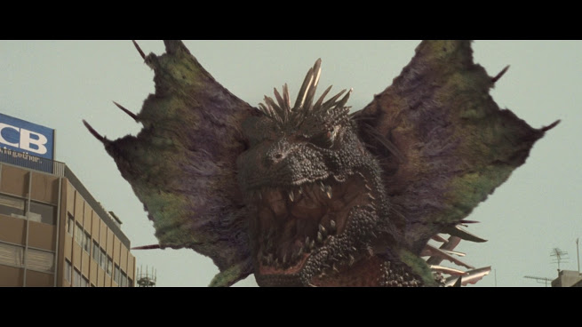
Gamera the Brave (2006) directed by Ryuta Tasaki


 I admit I have soft spot for Gamera, the giant flying turtle, as it is my mom's favourite kanji. Why my mom has a favourite kanji is another story. Gamera has always been a softer, maybe more kid friendly than some of the Godzilla films and with even smaller budgets. 

This film has some interesting elements. A man who was saved by Gamera as a boy and has a young son with psychological problems after his mother died. He finds a weird egg that hatches into  turtle that exhibits all sorts of intelligence and powers... much like Gamera, who had sacrificed himself when he saved the man. The son and the turtle grow a bond as the animal grows to gigantic size just in time fight the newly emerged monster Zedus. With the help of the young boy and his friends, the new Gamera is given extra power by a magic stone that was found at the same time the boy found the egg.  An epic battlic ensues and the new Gamera wins the day while the children cheer him on. 

This film is fairly fun though pretty dumb in many respects.  It has the problem most Gamera films do, one or more annoying child actors that really get on your nerves. It does have a really cool monster in Zedus, maybe one of the best giant monster designed out there. The effects are better than you might expect but Gamera has the look of kid's plush toy with giant eyes and baby like features that just do not work. It's hard to recommend this as children's film - Zedus is blown to pieces at the end which is gross but before that we see him eating hapless like chicken nuggets people multiple times throughout the film! 

Following the current trend for Japanese monster films to have better effects and more complicated storylines that may or may not work, this movie hits enough marks to be an enjoyable watch as long as you remember that it's a film about a giant flying turtle who is "the friend of the children". 


Monday, January 11, 2021

Poster project: Lon Chaney Jr's The Wolfman


Click image for larger version.

This was the one that started it all and almost anded it all. I tried several times to do a Wolfman illustration/poster over the years and never came close to getting anything close to what I envisioned. This is pretty far from what I going for back then, but I have been fairly successful or at least having enough fun with making monster poster more recently and gave Lawrence Talbot another go. 

I made a pretty detailed sketch based on quite a few reference images. I wasn't sure how much I wanted to show his shirt details and decided to try a style in-between the giant monsters and the classic horror monster posters. So mostly black and white wth hints of colour and still used the charcoal brushes in Krita  for the character. I used some brushes in Affinity photo and modified a 3 moon image I made a long while back which I painted over. The logo is from the opening credits of the film and remade in Affinity Designer. 

Despite the references I have myself  much more liberty to use my own imagination in the pose, details and lighting than in previous projects. Sadly the TONS of detailed I put into the fur on the head is now hidden in shadow but it looks better this way in my opinion. 

This one has a true "move poster" vibe to it. 


Sunday, January 10, 2021

poster project: King Kong (1933)


 I love the original King Kong, it was my Aunt Helen's favourite movie. She saw it many times when it was released. The looks of the creatures and the jungle scenes are just amazing and Kong is one of the few effects that really reads as a real character even today. 

This went through something like 30 iterations before I stopped changing things. Should Fay Ray be on the top of the Empire State? Should I draw the planes coming for Kong? At first it was to be just a long shot of the Empire State with kong seen tiny at the top and the planes arriving.  Finally after going though the film a few times I saw some interesting shots I had not seen used before and decided a mostly silhouetted Kong hanging off the building inspired by the screenshots and Willis O'Brian's preproduction drawings with an art deco design inspired by the opening credits might be best. 

The logo was interesting. It looks normal enough watching the film but if you start to recreate it it's sort of Escher-like in its construction. The letters looked carved but actually could never exist in the real world. I drew a simplified version of the tower and kept Kong mostly black with white highlights and some subtle dark greys to fill in details around his face. I looked at how the stop motion puppet was constructed to draw the feet and hands. 

There were a bunch of RKO logos in the 30s and I picked one that looked the most interesting with the other deco details. I added grain to the background elements so it would have that airbrushed from the period but excluded Kong and the titles so they would be super clear and stand out more. All things considered I am happy with this as it looks like what I was going for and combined my drawing and design skills in equal measure. I think so, anyway. I struggled with where to to put the title as it was on the bottom and small for most of the process and I did not want to cover his upper hand but it fits more on the top and larger and gives it more a feel of a poster from the time the film was released. 

A good start for 2021!

Monday, January 4, 2021

2021 Another Year in the Slammer

 I have been thinking seriously about the future of Celluloid slammer. Should it expand? Should it continue at all? 

Expanding might include a podcast or youtube channel, either would be a lot of work and cost more than zero dollars. Should I have Patreon? Not just for here but for the rest of my work including films, animations and artwork? 

We don't have a million followers here but a few that seem to read each post so my question to them and anyone out there is  - what do you think should happen? Let me know in the comments.

Speaking of comments, there are not many of them, just a few time to time which is OK but we do have trolls who post here and recently at my other site. Hard not total these things personally and keeping on top of deleting them is sometimes a chore. They are inane sexist rants about nothing or sometimes just some random post with a link to some random site in them. 

If anyone wants to join the Slammer and write posts, I'm more than open and that could help expand into you tube idea. There were ton of writers here for the first 7 or years and then a couple and now it's just me in solitary confinement, which to be fair is my favourite kind of confinement, but it makes for less voices talking about film and related topics here. 

Sunday, January 3, 2021

Poster: Creature of the Black Lagoon


Click images to see larger versions.

Still not sure how successful this is but it is a much more fully realized illustration I think. It has background and foreground elements and isn't as graphic design oriented as my giant monster  or sci-fo posters. Again done in Krita and charcoal brushes and too about 25 hours of drawing time. There are many details hard to see unless you are close up to it, like the texture on the creature's skin. I used  the blending stump brush like I did with real charcoal sticks on paper. I drew the underwater weeds over and over again, simpler versions just didn't look right. The sketch was a good guide even though I changed some details like how the swimmers foot was postitioned. For something like this I make a detailed sketch so I can make a grey silhouette and then add shadows, highlights and details and the drawing seems to push itself out of the canvas as I draw. The bubbles etc were just freehand with no plan. I just kept at them until it looks OK to me.  

I looked through the film for references and used bits and pieces as inspiration but I have found the clearest references were photos people took of models made of the monster. The film is burry and grainy and the details are often obscured, especially with the pose I was looking to use. I wish I had unlimited funds to buy some of these toys so I could play with more poses myself. 

I love the costume from this movie. It's one of the best monster design out there and rivals Lon Chaney Jr's Wolfman make-up. It is really well thought out and detailed. The eyes look a little too painted on in some shots but it works